What is a “dialog”
A dialog is both a semantic HTML element and a UX pattern in which a “conversation” occurs between the user and the system.
Dialog types
There are two types of dialogs:
Modal: A modal dialog is an interruptive experience that demands the user’s attention and renders the rest of the page inert. It is often coupled with an overlay to obscure the page underneath and requires user action to proceed. The Modal component is an example of this.
Non-modal: A non-modal dialog minimizes interruption by allowing the user to continue interacting with the rest of the page. It does not always require user action and is often dismissed on its own. The Toast component is an example of this.
Conversation types
Conversations between the user and the system can be:
One-way: A conversation in which the system communicates directly to the user. One-way conversations are commonly initiated when the system’s state changes, e.g., by notifying the user of a successful background process. Non-modal dialogs are best used for one-way conversations.
Two-way: A conversation between the system and the user. It is commonly initiated by a user action, e.g., interacting with a button, and often requires user engagement. Modal dialogs are best for two-way conversations.
What a “dialog” isn’t
Form errors and alerts
When a form is submitted with errors, it’s common to show an alert before the form. This kind of experience is not considered a dialog because, although the system communicates the error to the user (conversational), alerts do not overlay the UI or interrupt the user’s workflow.
Tooltip or Rich Tooltip
While the Tooltip and Rich Tooltip overlay the UI and block content underneath, they display static informational content and are not seen as a conversation between the system and user.
Creating custom dialogs
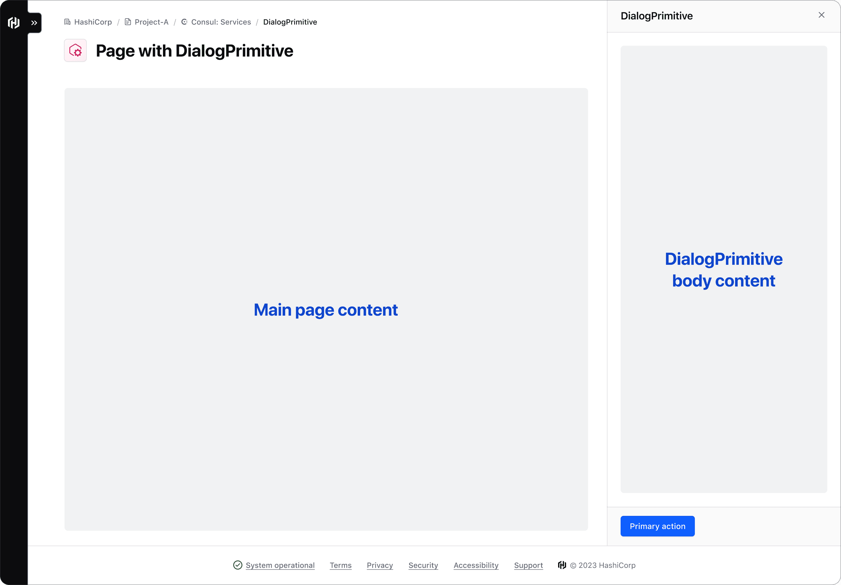
A common example of a non-modal dialog is a SplitWindow, Panel, or Drawer. This type of component allows the user to interact with both the main page content and the content within the dialog.
If you discover other use cases, contact the Design Systems Team for assistance.
The DialogPrimitive contains the building blocks used to construct dialog-based components and consists of:
DialogPrimitive::Wrapperis the structure that contains and arranges all other dialog primitives.DialogPrimitive::Headercontains the title, dismiss button, and optionally a visually supportive icon and tagline.DialogPrimitive::Descriptioncontains optional descriptive information about the dialog.DialogPrimitive::Bodyis a generic container that houses the main content or message of the dialog.DialogPrimitive::Footercontains buttons to act on the content in the body container or link to additional resources.
The DialogPrimitive Wrapper is built on the HTML <dialog> element, and therefore supports the same JavaScript API.
How to use this component
The DialogPrimitive serves as the foundation for dialog derived components like the Modal and Flyout. Unlike other HDS primitives, we recommended using DialogPrimitive components directly when you need to create a dialog with a custom layout. This is particularly useful for constructing non-modal dialogs that integrate into a page layout, rather than floating above it.